Last weekend was one of the most gratifying I’ve had in a while. It was the culmination of a lot of time, mental & physical effort, pre-planning and a 72-hour grind that resulted in a wonderful outcome for my client.
Backstory…
Before - her prior home
I’ve worked on this property a few times now. The first round was to help stage it for a move, but then the move was postponed because she fell in love with the house all over again! Flash forward to a few months ago, it was finally go-time on the move.
Over the course of the last ~4 months together, we have worked tirelessly both in-person and from a distance to mentally prep, declutter, hatch a design plan and execute the move. Here I will walk you through my process helping her get set up for moving success.
We started with a major purge - I flew out, took inventory of all of her belongings, helped her organize and say goodbye to a ton of unneeded stuff. We discussed her goals for the new place, budget, priorities and identified problem areas.
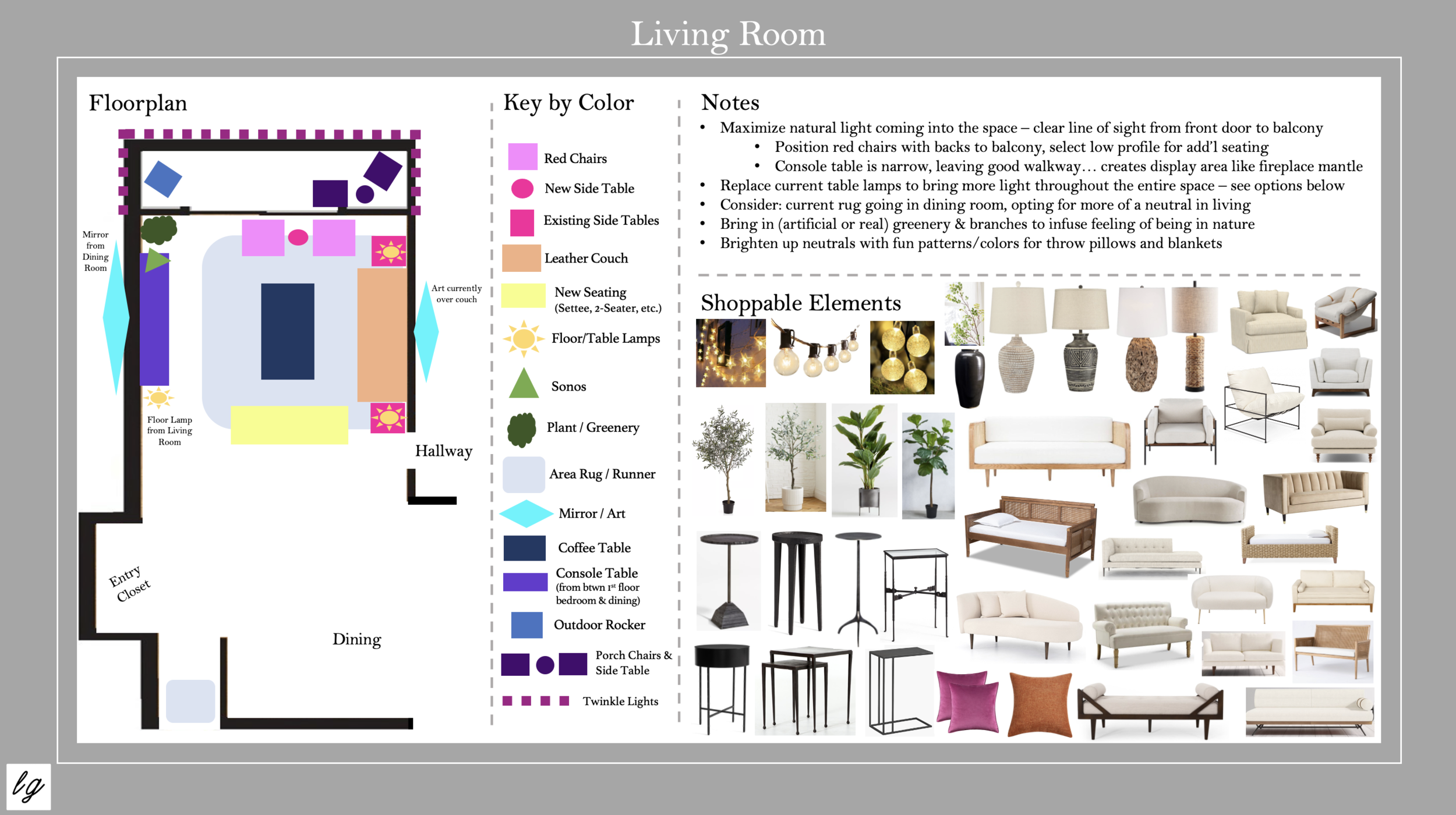
Upon returning home, I put together a thorough Design Analysis for her new place. I created layouts for each room, accounting for every piece of furniture she wanted incorporated into the design. I sourced furnishings and decor for remaining pieces to fill in the gaps, and crafted solutions for all of the problem areas.
Let’s take a close look at the living room…
Layout provided by the building…
My suggested layout during pre-planning…
Key
As you can see, the proposed layout provided by the building is quite different from what I came up with. They have a couch and chairs positioned facing a TV - which, in my opinion, does not honor the views coming in through the balcony or make best use of the space. My client’s goal was to have a living room for entertaining, without a TV, utilizing as many of her existing furnishings as possible.
By positioning the couch facing inward with its back to the wall, we created a ton of open space to work with while giving anyone seated on the couch a beautiful view of the outdoors. Once in the space, the red chairs worked better facing the balcony, and the wingback chair I originally thought would go elsewhere worked well in the corner. That’s where open-mindedness and experimentation came in…
I repurposed a console table to create a display area (making up for the fireplace mantle she was losing in the move) and help balance out the weight of the couch positioned across from it. I layered in a mirror to maximize the natural light coming in, along with a few new lamps to refresh the look.
The end result (pictured below) is cozy, inviting, still somewhat of a work in progress, but 95% there. Yet to come are a tree for the corner to the right of the doors, more greenery for the balcony, some new throw pillows and art hung on the walls. We were thrilled with how many of her existing belongings worked in this new space - she was essentially able to take her living room with her, just tweaked slightly to accommodate the new setting.
After - her new home! My goal for every seating area is to create the most comfortable environment for a good conversational flow. I envision how interactions will go from every seat in the space - striving for a “circular” formation, where everyone can see each other when it’s at full capacity. I am also mindful of walkways, natural light sources, entryways and proximity to the bathroom to ensure people can come and go without disruption to the group dynamic.
I created a little vignette to make up for the fireplace mantle (focal point) she was losing in the move. By repurposing a console table from another area of her home, I was able to balance out the weight of the couch on the opposite side of the room, while keeping a clear walkway for people entering the space. The mirror enhances the natural light, the branches add texture, the few pieces of decor are sentimental and the blend of woods and natural elements (including the repurposed firewood basket) create a cohesive earthy feel to compliment the parquet wood floors.
Below are the Shoppable Elements I sourced for her to complete the look. We ended up sticking with the wingback chair in the final layout so we no longer needed an additional seating piece…
The full Living Room slide from her Design Analysis for reference…
The Living Room slide in full… one of 12 slides from her Design Analysis!
By the end of the weekend, I had performed this process for each room - dining, bedrooms, den, bathrooms. By the time I left, 98% of the boxes were gone and most everything was in its place and she had a clear action plan for completing each look. The most rewarding thing about it was witnessing her feel comfortable and at home in her new space after such a monumental change. (I have a ton of suggestions for how to decrease stress/increase efficiency while moving, but I’ll save it for another post!)
I’d love to hear your thoughts! Comment below or reach out to me here…
Until next time,
LG


